Work  /  Bridges Community Health Centre
Case study · Branding & visual identity

A warmer, more human face for community care

Bridges does deeply human work across Fort Erie, Port Colborne and Wainfleet, but its materials looked different every time. We built one warm, consistent identity, then a full kit of posters, cards and social templates so it holds together everywhere.

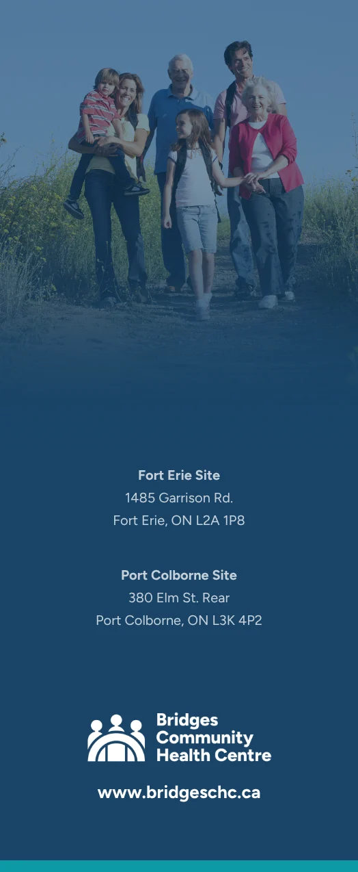
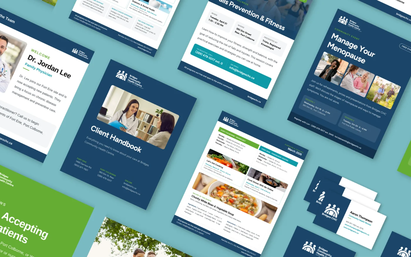
Bridges Community Health Centre print and digital materials we designed
Client
Bridges Community Health Centre
Services
Positioning & strategy · Identity · Print · Social · Guidelines
Serving
Fort Erie · Port Colborne · Wainfleet
Engagement
Full brand identity project
The project

A brand as caring as the people behind it

Bridges provides accessible, wrap-around health care, but the brand didn't reflect that warmth. Materials looked different from one program and location to the next, so nothing felt like it came from the same organization.

We started with positioning and strategy, then rebuilt the identity around it: a friendlier mark, a warmer palette and clear typography, extended into a full working kit of posters, flyers, rack cards and ready-to-use social templates the team runs themselves.

The outcome

One consistent, welcoming brand

A single identity that staff can actually use, that reads as approachable to patients, and that holds together across every poster, card, post and location.

Warmer, more human
An identity that feels approachable, not clinical
Consistent everywhere
One look across programs, print and social
Easy for staff
Templates anyone can pick up and use
Bridges Community Health Centre logo, reversed on brand navy
01 · The identity

A mark about people, gathered together

Three figures under a bridging arch: welcoming, human and instantly readable at any size. We paired it with a warm, reassuring palette and clear, accessible type, and set rules for how it all works together.

Navy
Teal
Green
Paper
02 · Print system

Every printed piece, one system

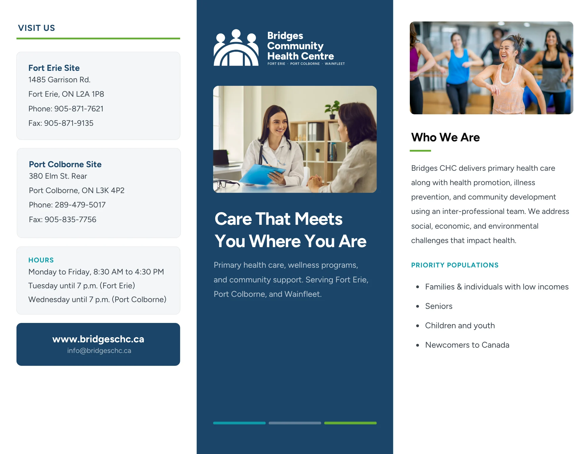
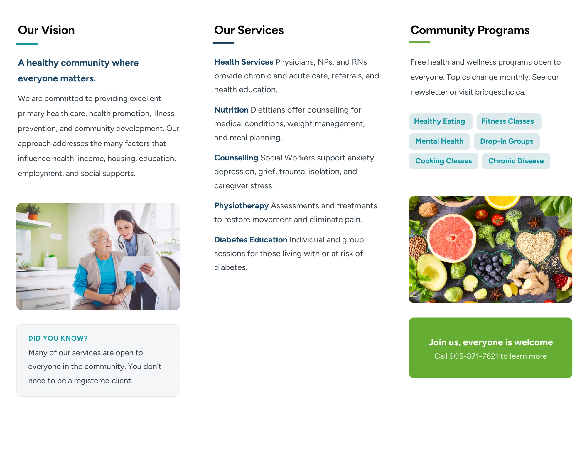
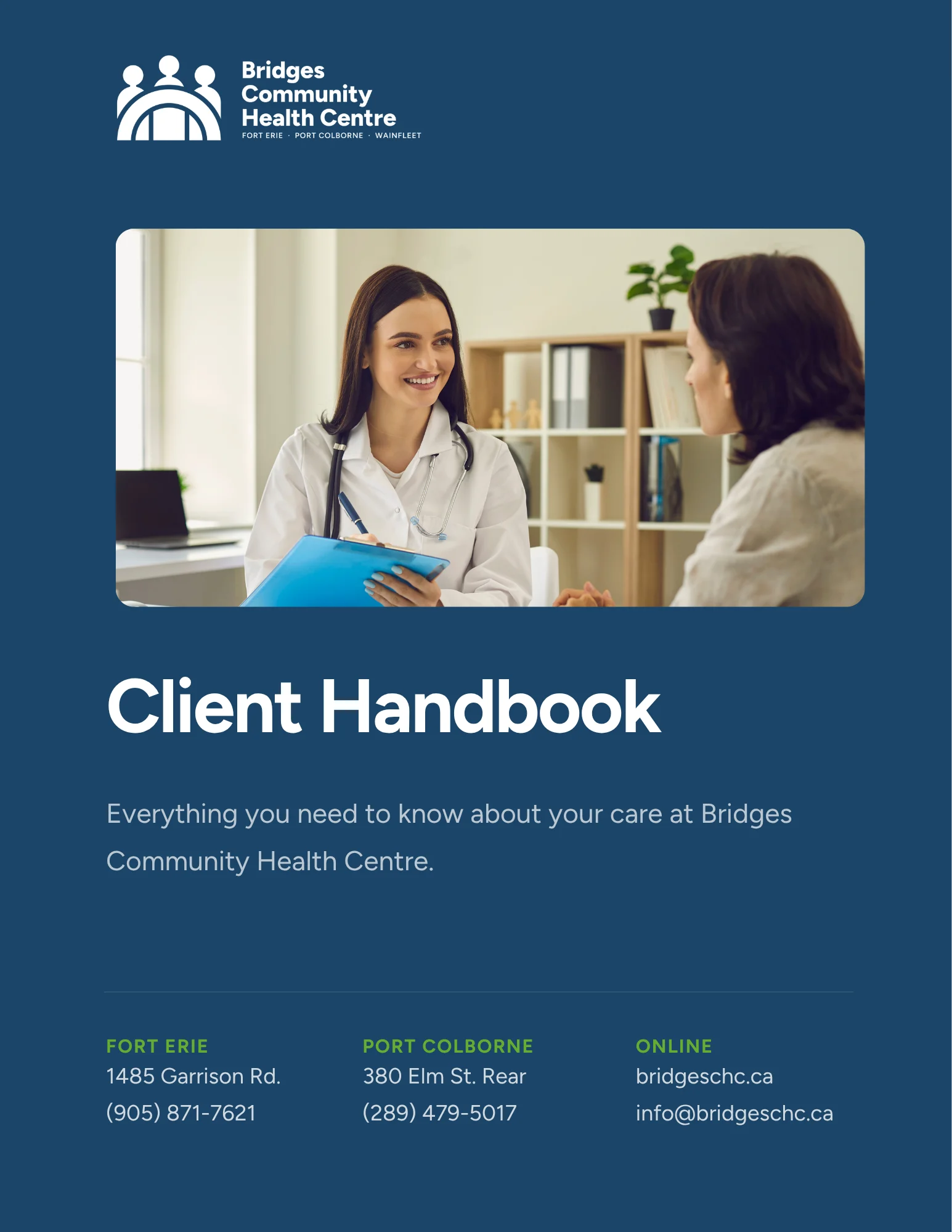
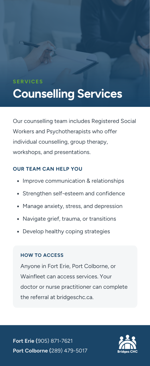
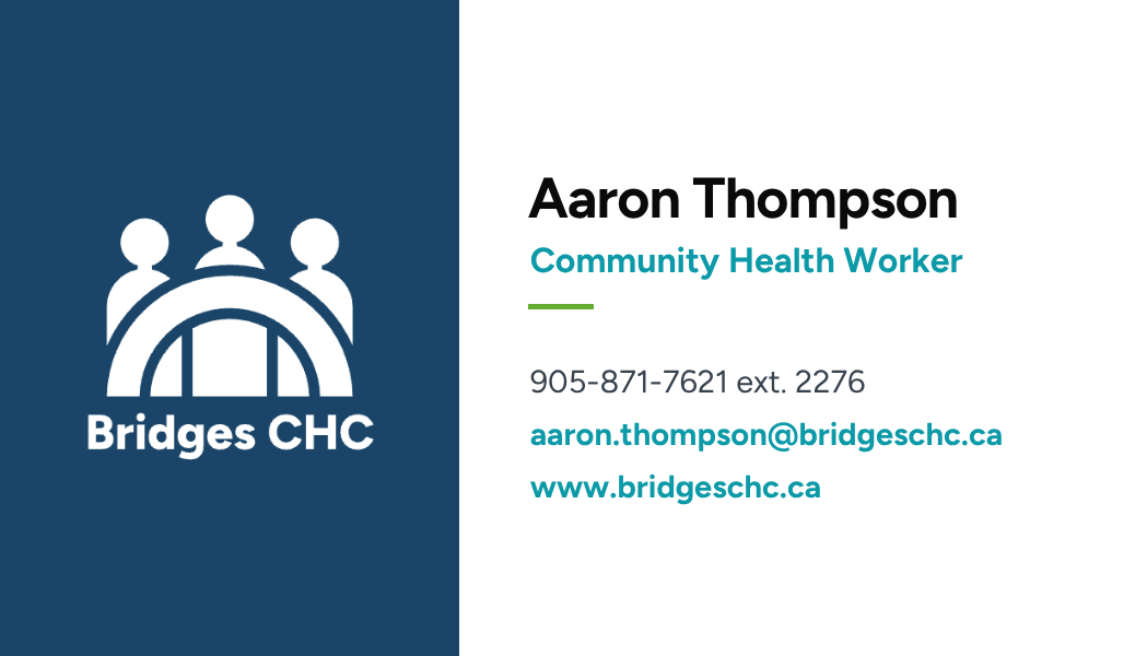
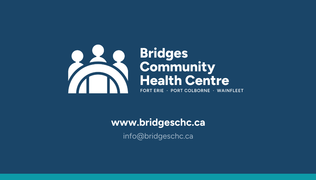
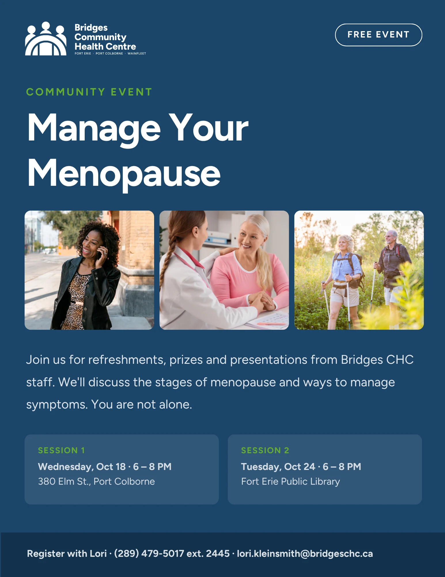
Business cards, posters, rack cards, the client handbook and a tri-fold brochure, all built on the same grid and palette, so every piece reads as one organization.
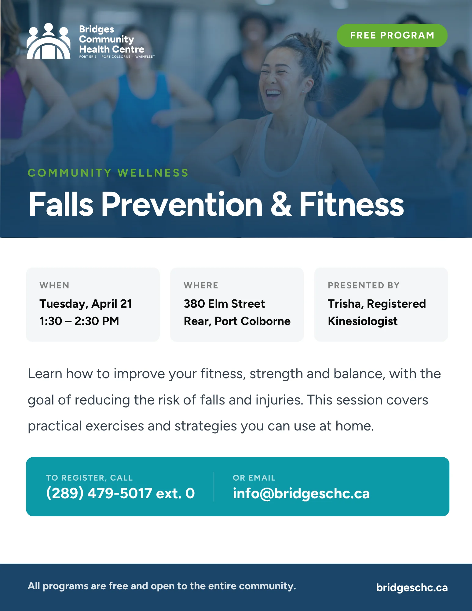
Falls Prevention and Fitness poster
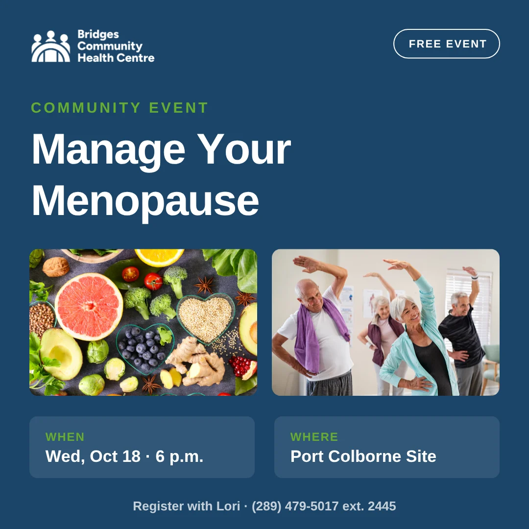
Manage Your Menopause poster
Bridges tri-fold brochure, outside spread
Bridges tri-fold brochure, inside spread
Bridges client handbook cover
Counselling Services rack card, frontRack card back
Aaron Thompson business card, frontBridges business card, back
03 · Social system

One system, dozens of posts

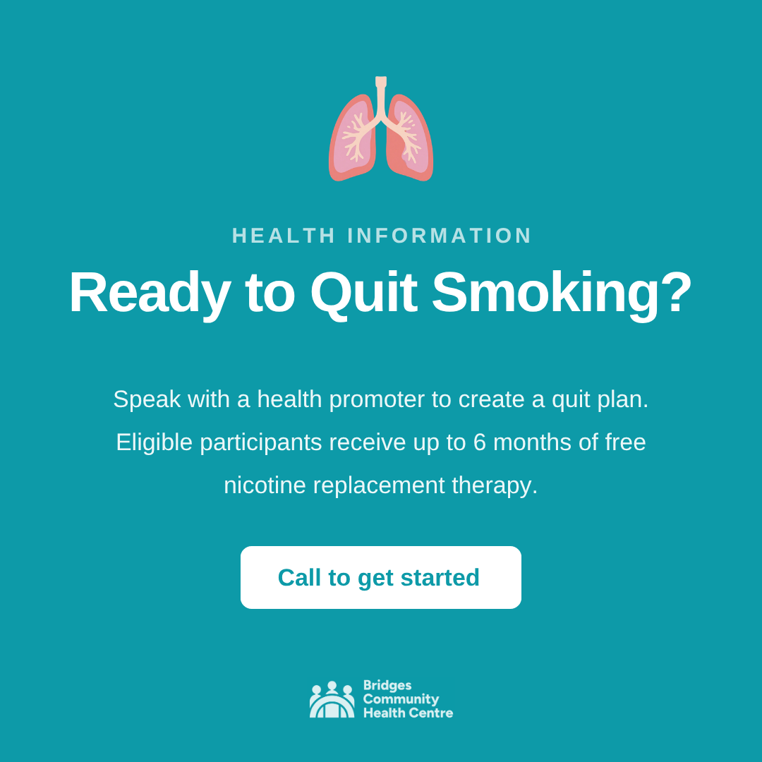
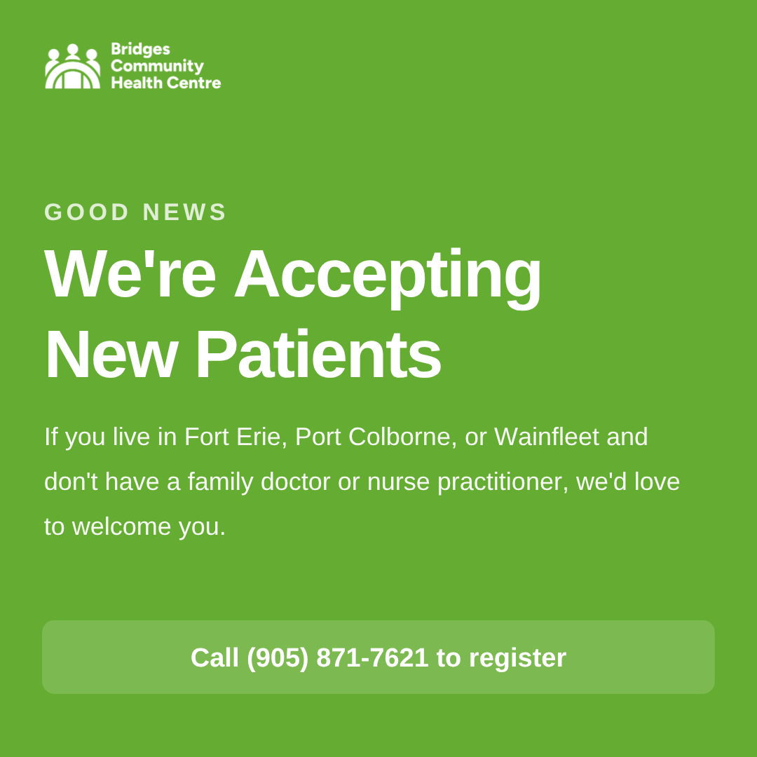
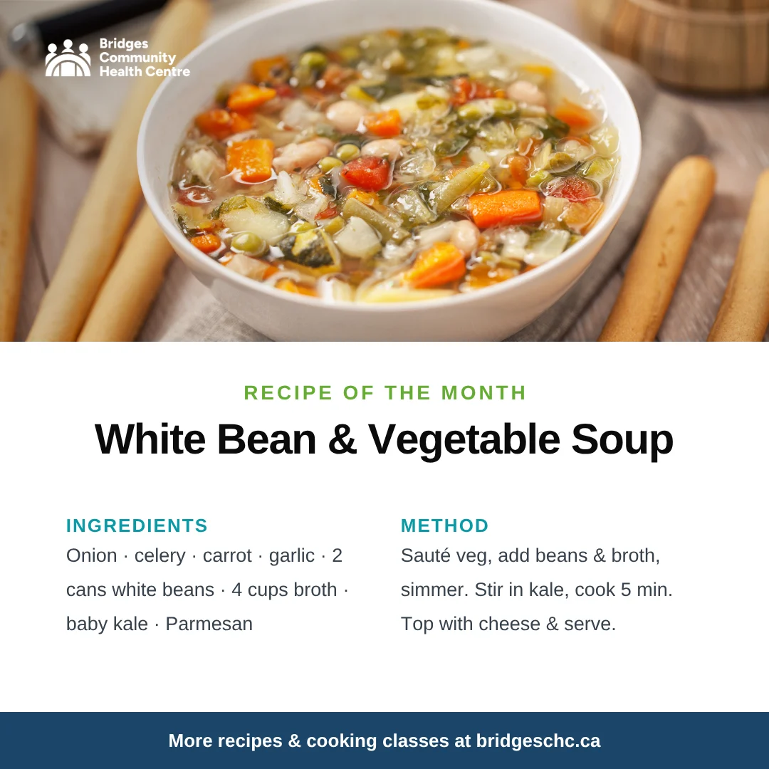
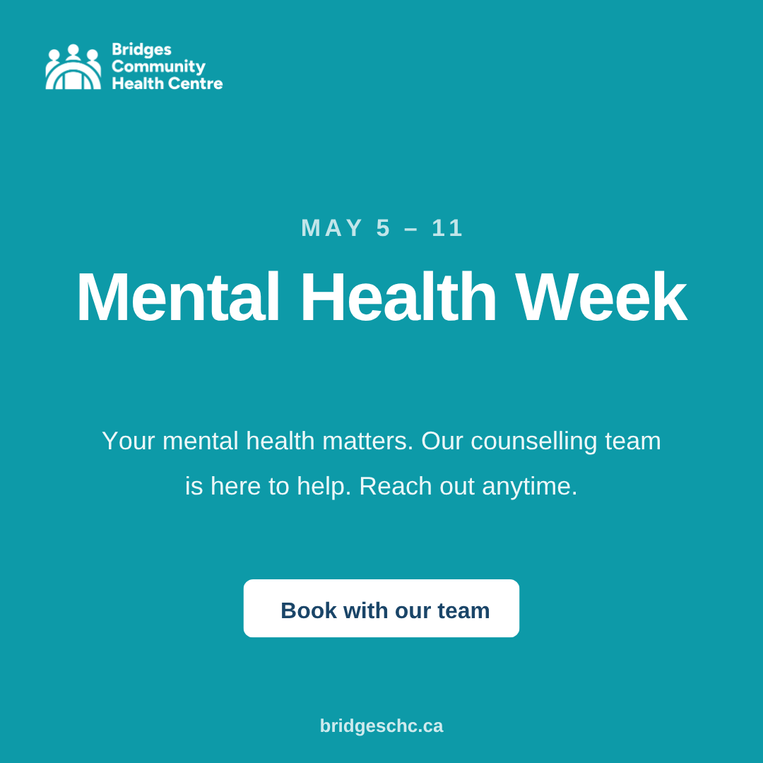
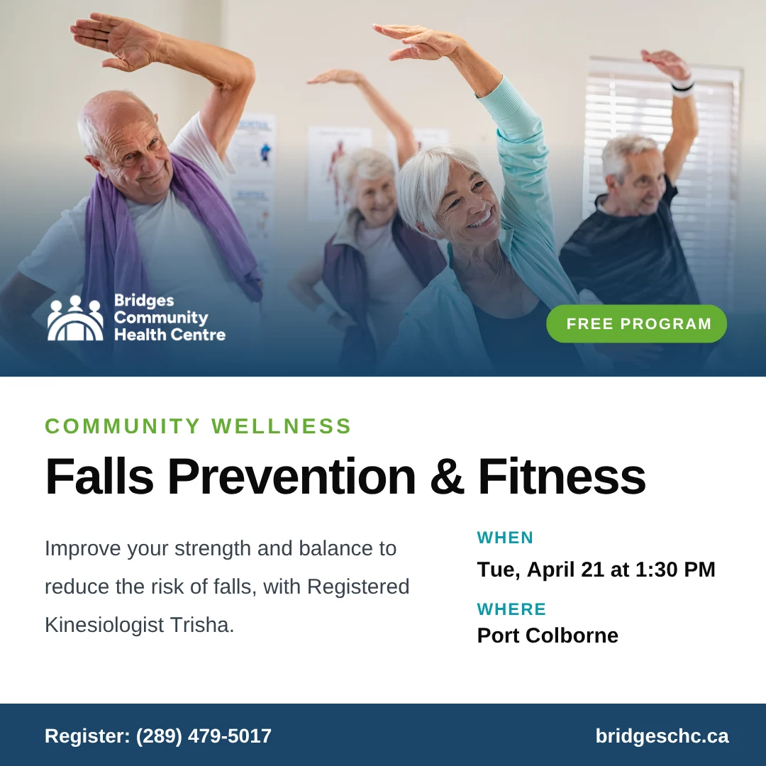
A flexible set of templates for events, health tips, recipes, hiring and notices, so the team can post all year and every piece still looks unmistakably Bridges.

9:41
Bridges
bridgeschc
Port Colborne, Ontario
⋯
Falls Prevention and Fitness post
148 likes
bridgeschc Improve your strength and balance to reduce the risk of falls. Free program with Registered Kinesiologist Trisha, Tuesdays in Port Colborne.
2 HOURS AGO
Manage Your Menopause post
Ready to Quit Smoking post
Accepting New Patients post
Recipe of the month post
Mental Health Week post
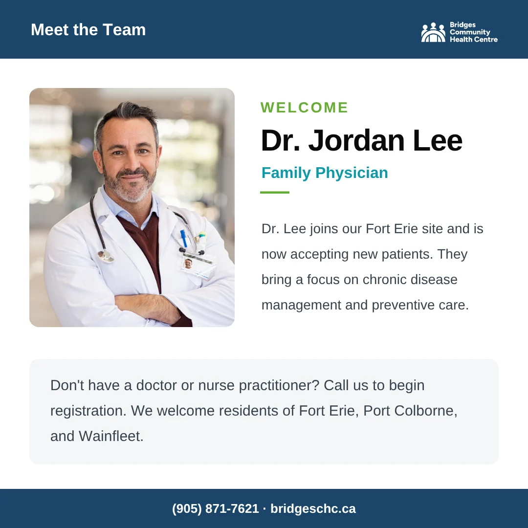
Meet the team post
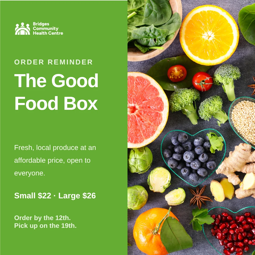
Good Food Box post
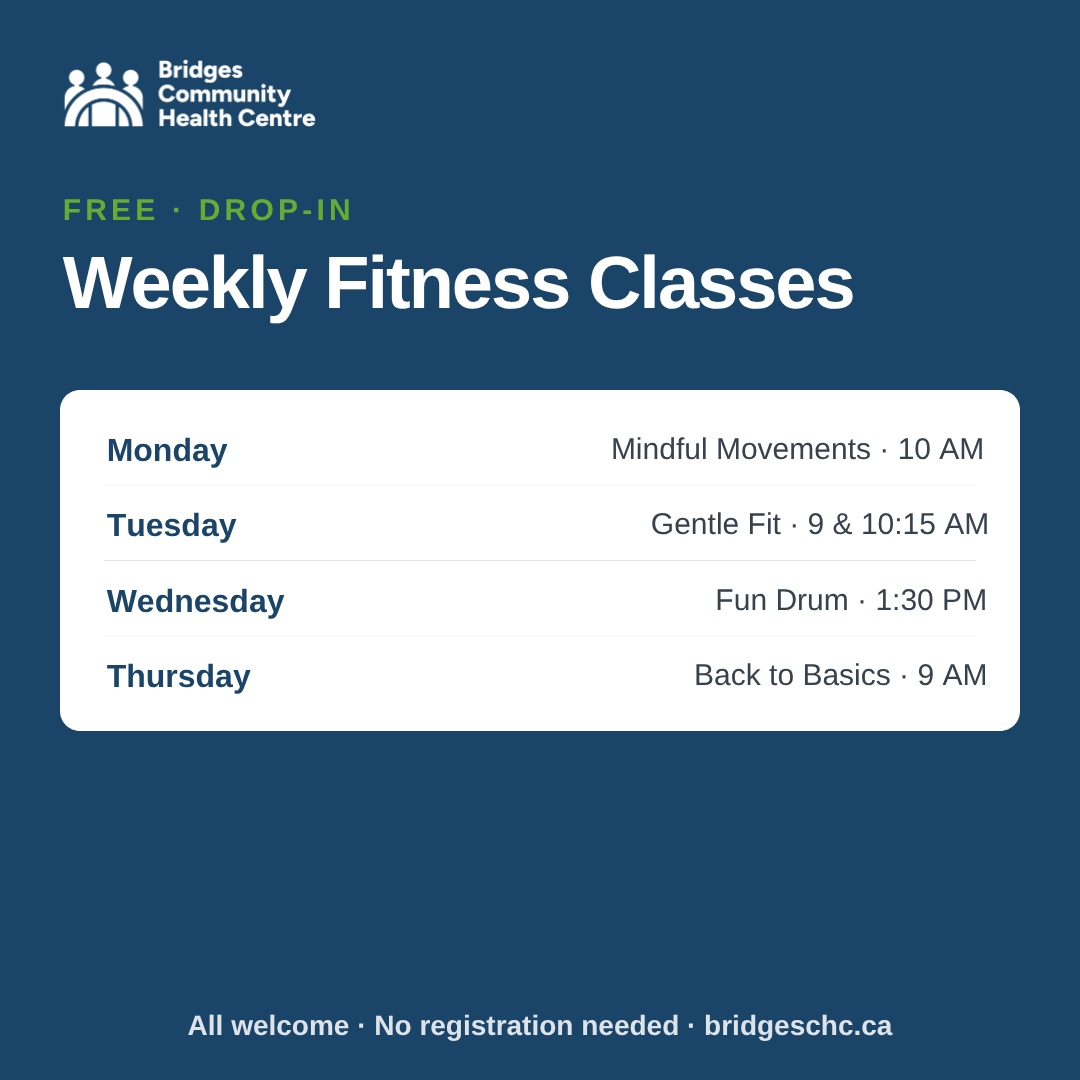
Weekly fitness classes post
What we delivered

A complete brand kit

Everything Bridges needs to stay consistent and welcoming, handed over ready to use.

✓Brand positioning & strategy
✓Logo suite & wordmark
✓Colour palette & typography
✓Program posters & flyers
✓Rack cards & print collateral
✓Social media template system
✓Branded apparel & merch
✓Full brand guidelines

Need a brand that feels like you?

Whether you're starting fresh or refreshing a brand that no longer fits, we'll build an identity, and everything it touches, that's clear, consistent and unmistakably yours.